SuiteAnalytics Workbook is a fully configurable workbook that incorporate datasets, tables, pivot tables, and charts in a single tool that takes advantage of the new analytics data source.
Reporting and analytics are arguably two of the most important aspects of any good ERP solution. Getting crucial, meaningful business data easier and faster is more important than ever and NetSuite have addressed this need with Workbook, a new feature built into SuiteAnalytics. It is a easy to use toolkit that can create, analyze and share your business data. SuiteAnalytics Workbook makes it possible to explore and visualize data natively within your NetSuite environment.
Although NetSuite already provides us with some datasets and workbooks to work with, what we would like to show you below is how simple it is to create your own dataset and workbook from scratch, in this easy to follow step by step guide.

Before we begin, lets set the scene and create some business context for you:
![]() You own a clothing store chain with different product lines (setup as classes on NetSuite) and you sell to customers across the world (custom segment called Geography)
You own a clothing store chain with different product lines (setup as classes on NetSuite) and you sell to customers across the world (custom segment called Geography)
![]() You would like to see how many sales you have generated per product line and across the different countries you sell to, in both a tabular format as well as a graph on our dashboard
You would like to see how many sales you have generated per product line and across the different countries you sell to, in both a tabular format as well as a graph on our dashboard
What to do:
Step 1:
Creating a dataset in SuiteAnalytics Workbook
In SuiteAnalytics Workbook, you analyze your company data using two distinct objects: a dataset and a workbook.
Datasets are the basis for all workbooks and workbook visualizations in your account. In a dataset, you combine record type fields and criteria filters to create a query. The results of this query act as the source data for your workbook visualizations. A single dataset can be used in multiple workbooks and workbook visualizations.
To create a dataset:
- Go to Analytics > Datasets > New Dataset.

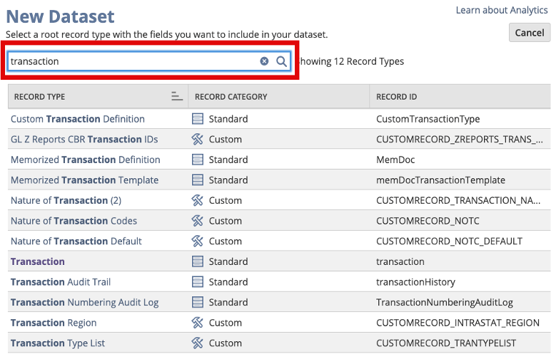
- Select the type of dataset you would like to create. For this example, since we would like to get the sales data, you are going to create a ‘Transaction’ Dataset.

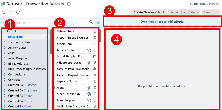
- The following screen is divided into 4 main parts:
 Section 1: Record – In this section, you can combine your transaction (default) data with other records (e.g.: customers) on NetSuite.Section 2: Fields – In this section, you can select the fields that should be displayed in your dataset.Section 3: Filter – As the name suggests, you can add some filters to your dataset. In our example, we have specified that we would like to see all data from our invoices and cash sales that occurred within this year.
 Filter example #1: Show only cash sales and invoices in our dataset.
 Filter example #2: Show only data within this fiscal year.
 Section 4: Real-time preview of your data – In this panel, you’d be able to see a real-time preview of your data as you add more fields and more filters to your dataset.Once you’re done, you can click on the “Save” button.
Step 2:
Creating a workbook
Workbooks are where you analyze the results of your dataset queries using different visualizations, such as tables, pivot tables, and charts. All workbook visualizations are based on a dataset, and you can use different datasets for each visualization in a single workbook.
To create a workbook:
- Go to Analytics > Workbooks > New Workbook.

- We are going to select the dataset that we created in Step 1.

- Your workbook homepage is divided into 2 main parts:
- Part 1 – Your Dataset
- Part 2 – Type of Visualization you’d like to create

- For this example, first create a pivot table.When you choose the option “Pivot”, you will be introduced to the following screen:
 From the left panel, you have all the fields from the dataset.In the middle panel, you can choose the layout of your pivot table. For this example, you would like to see your sales data by product lines (classes) as rows and geographies as columns. Note that you can further add more fields to the rows and columns section of your pivot table for a deeper analysis of your data.The pivot table now looks like this:
 If we zoom in:
 Of course, you have the option of sorting the data as you deem fit:
- Once you have your pivot table, you can visualize this data in a graph and add it to your dashboard.From the same screen, you can click on the “+” sign and you can now choose “Chart” as the visualization type for your dataset.

- The chart screen is divided into 3 parts:
 Part 1: Fields from you datasetPart 2: How we would like the layout of our graph to be. For this example, you would like to see the sales by different geography.Part 3: Real-time preview of your graphYou can also add a series and let’s say you add class, your graph will now be:
 Of course, you can print or export your graph.
Step 3:
Adding the workbook to our dashboard
In the last step, you would like to add your graph to your dashboard.
From your dashboard, click on the “Personalize” link and choose “Analytics”.

Setup your analytics portlet by clicking on the “Setup” link or the 3-bar menu at the top of your portlet.
Choose the visualization type.
Select your chart.

Click on add.

You can also change the chart type:

